A law firm site with the weight of a real practice
Visit live siteGravitas doesn't mean stiffness
Law firm websites in the region all look alike: a ready-made template, a glass-building photo, and copy about "trust and professionalism". The client wanted the opposite — a visual presence matching the firm's standing, without sliding into the kind of showmanship that costs a profession its dignity.
So the premise: a bronze Lady Justice emerging from darkness as the page scrolls, as though the visitor walks into a hall and approaches the statue. One deliberate motion carries the opening; everything else stays quiet and readable — luxury through restraint, not through effects. And the hardest constraint wasn't aesthetic: Arabic is the default language, fully right-to-left, with English as a full peer rather than a bolted-on translation.
The 3D model, before and after
18 million vertices — impossible to ship on the web.
meshopt compression with no simplification — full detail intact.
Slight simplification you can't perceive on a small screen — and a huge speed difference.
The device picks its own version at load time. On mobile the visitor downloads 3.1MB instead of 191MB — under 2% of the original, in a scene that looks the same to the eye.
Four problems that ate most of the time
A cinematic scene that doesn't tax the device
The camera travels a keyframed path tied to six screens of scroll: it closes in on the face in darkness, then pulls back as golden light rises until the statue is fully revealed — rendering frames on demand rather than in a permanent loop. The material itself was re-calibrated in code, not in the modelling software, until it matched the real bronze statue in the firm's office.
Two file builds per device class, a pixel-density cap on mobile, and lazy loading for the whole scene.
Native Arabic, not a mirrored interface
Direction switches at the document level, and layout is built on logical properties instead of hard-coded left/right. Horizontal motion flips automatically — otherwise text slides to the wrong side in Arabic. A separate typeface per language, 250 translation keys each, and hreflang links that tell Google the two versions are peers, not duplicates.
One costly detail: Arabic descenders were being clipped inside animation masks — fixed with dedicated bottom padding.
The form said "success" — the sheet stayed empty
The most dangerous bug in the project was silent. Consultation requests were submitted, the visitor saw a success state — and nothing reached the company's sheet. Real clients were being lost with nobody knowing. The cause: a hidden bot-trap field named company, which the visitor's browser was filling via autocomplete — so genuine requests were classified as bots and silently dropped.
The field was renamed to something autocomplete doesn't recognise, and the fake-success path was removed: no success message until the sheet confirms the write.
Holding the image steady on mobile
Scrolling on a phone hides the browser's address bar, which changes the viewport height, which re-calibrates the camera — and the model jumps. Fixed by pinning the canvas to the largest possible height and ignoring height-only changes. Page-wide: ambient audio loads only on request, and images reserve their dimensions up front.
Cumulative layout shift settled once an async font load — which reflowed the text in one go — was reverted.
The tools
Core
- Next.js 16 · App Router
- React 19
- Tailwind CSS v4
- JavaScript, not TypeScript
Motion & 3D
- GSAP ScrollTrigger · SplitText
- Three.js + React Three Fiber
- drei + postprocessing
- Lenis — smooth scroll
Content & Ops
- next-intl — ar · en
- Google Apps Script — lead intake
- Vercel — deploy & analytics
- Schema.org LegalService
What actually shipped
- Home page with a 3D scene
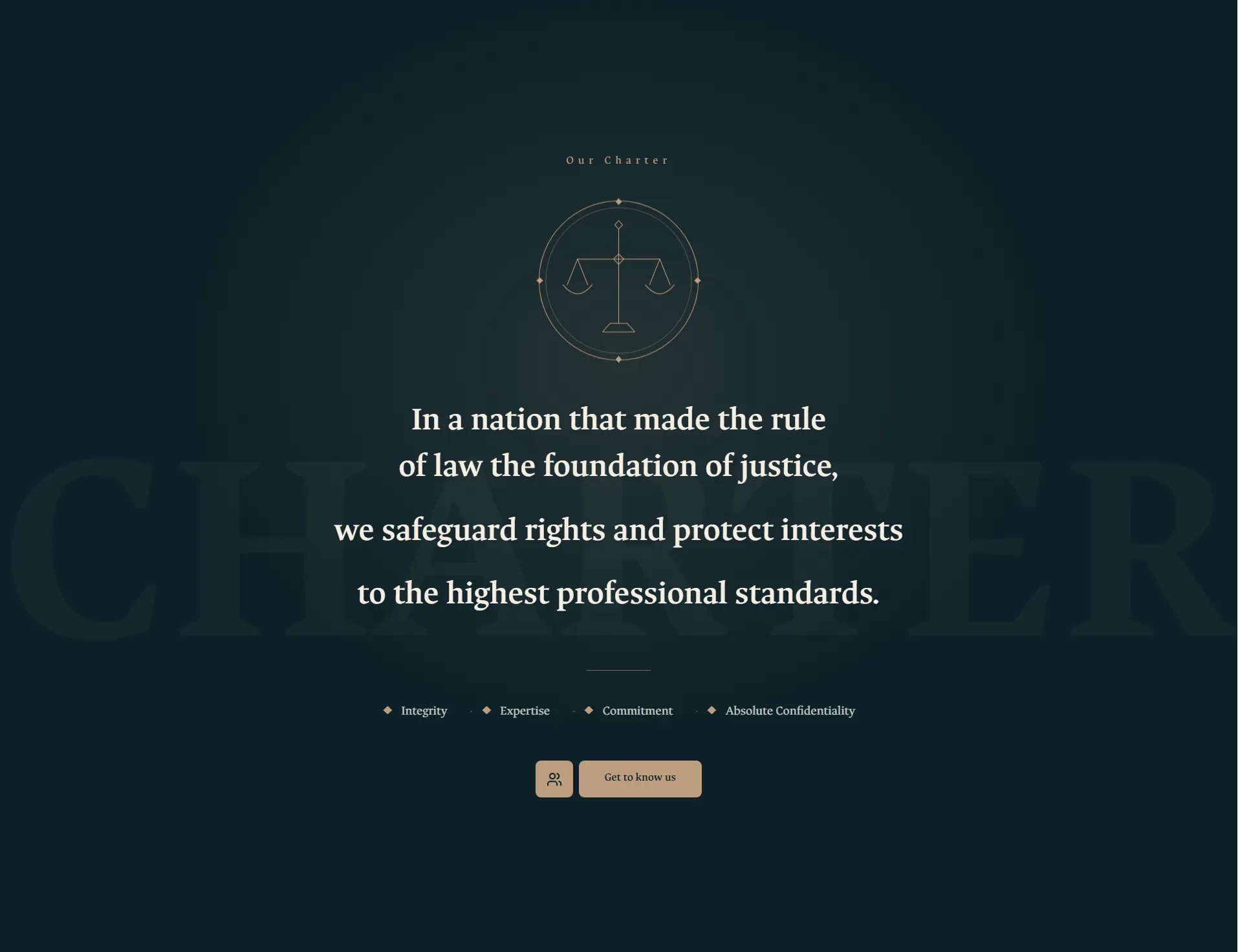
- Firm charter and the story of the name
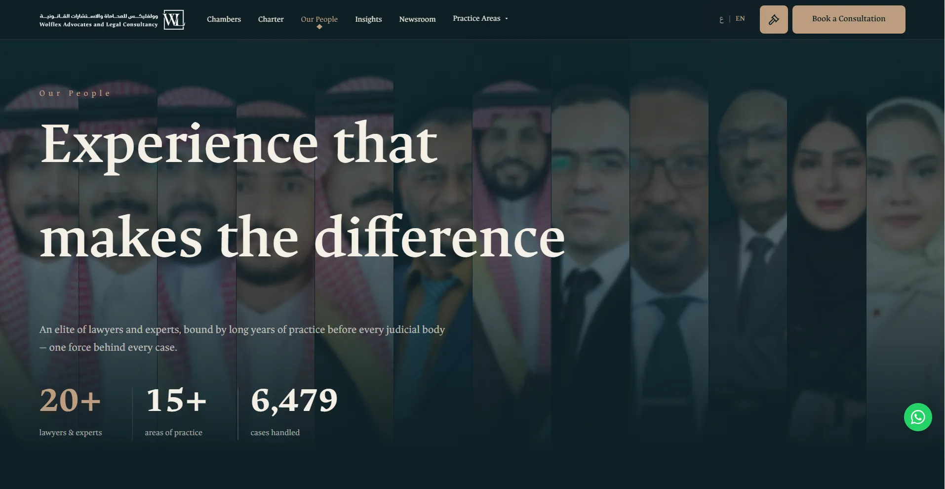
- 20 team members in a cinematic view
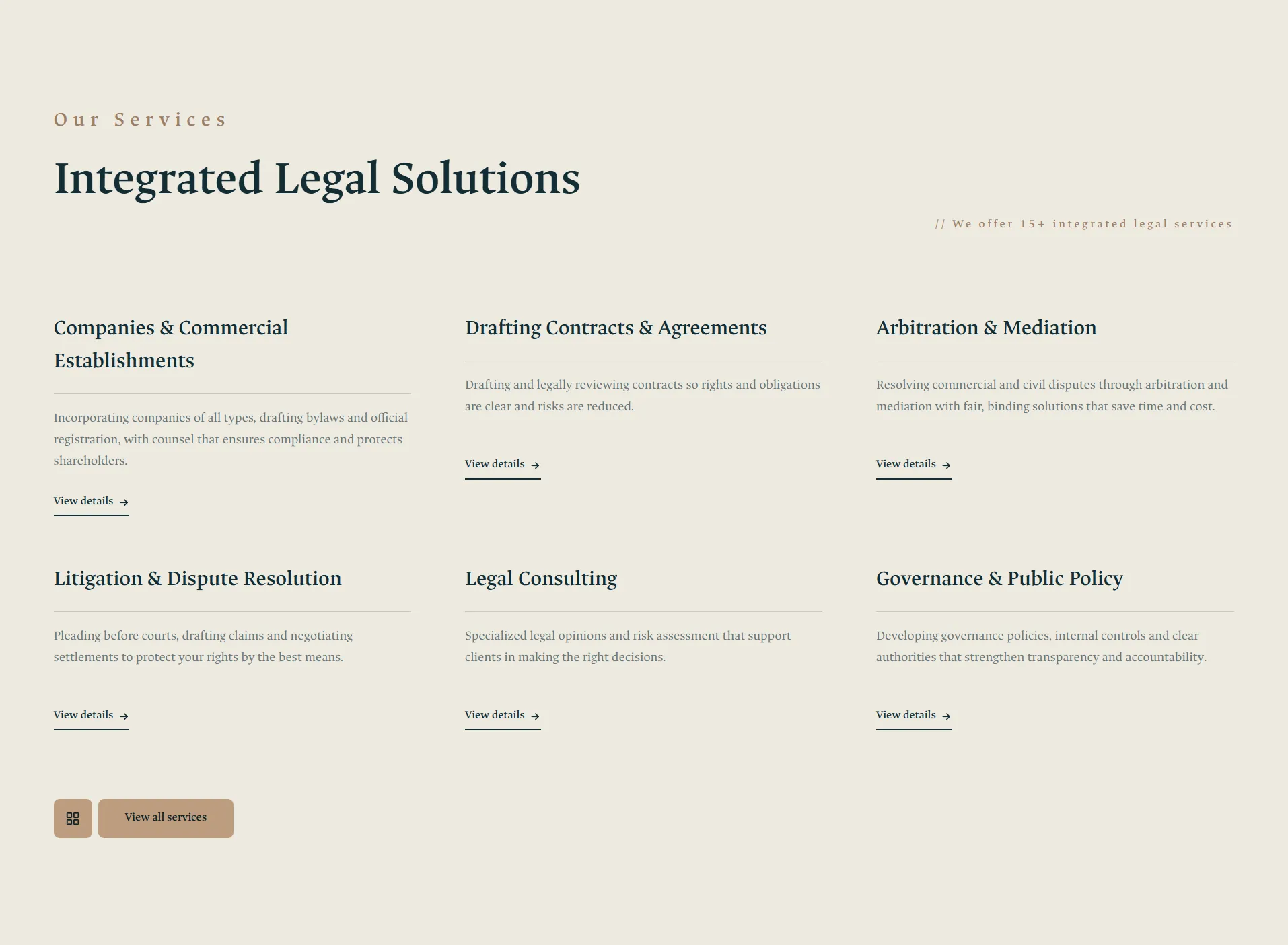
- 19 practice areas
- "Basa'ir" blog and a news section
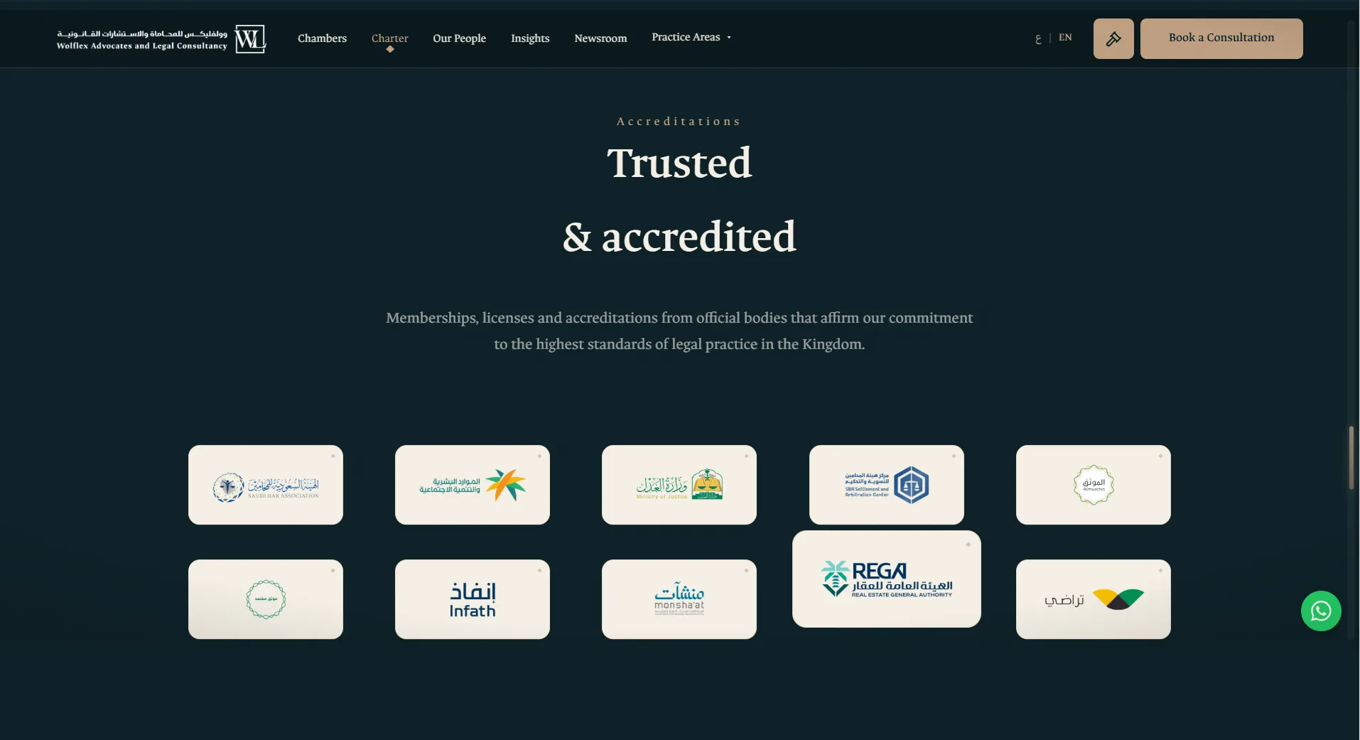
- 26 client logos in a marquee
- Terms of use and privacy policy
- Consultation form with rate limiting
- Embedded map and direct WhatsApp
- Loading screen that draws the logo
- Instalment payment options in the footer
- Sitemap and structured data for search
Inside the site
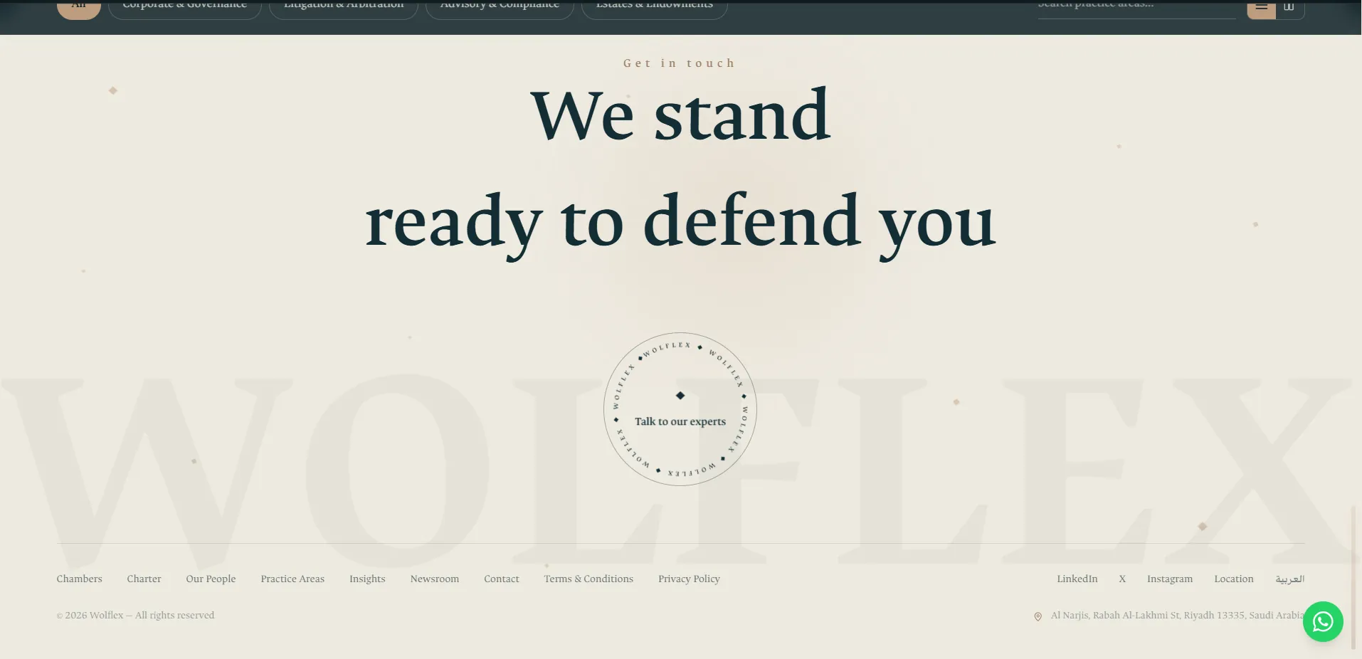
The lesson that stayed
The 3D scene took a long time, but the most valuable hour on this project went to a fault nobody could see: a form smiling at the visitor while their message vanished. A beautiful interface attracts the visitor; the reliability behind it is what turns them into a client.
No success message until delivery is genuinely confirmed.
Want a similar experience for your project?
Let's build a site that stops your visitors the way this one stopped you — and delivers every request for real.
Tell me about your project