
The diagnosis
Three people independently said a version of the same thing: “it reads like a newspaper”, “it feels like scrolling a Word document” — and none could say why. So I stopped arguing and measured the page: 5,014 characters with zero images, 1.15:1 contrast between two supposedly alternating grounds, and six of six sections at exactly 1430px wide. The page had one shape, repeated six times — which is why it read as one long article no matter how the words changed.
The idea & execution
A section's shape is its thinking
Six client situations are parallel entry points, not a sequence. Six possible answers are branches, not a list. Five commitments accumulate. Twenty-four services are a register. Four kinds of thinking — four different shapes.
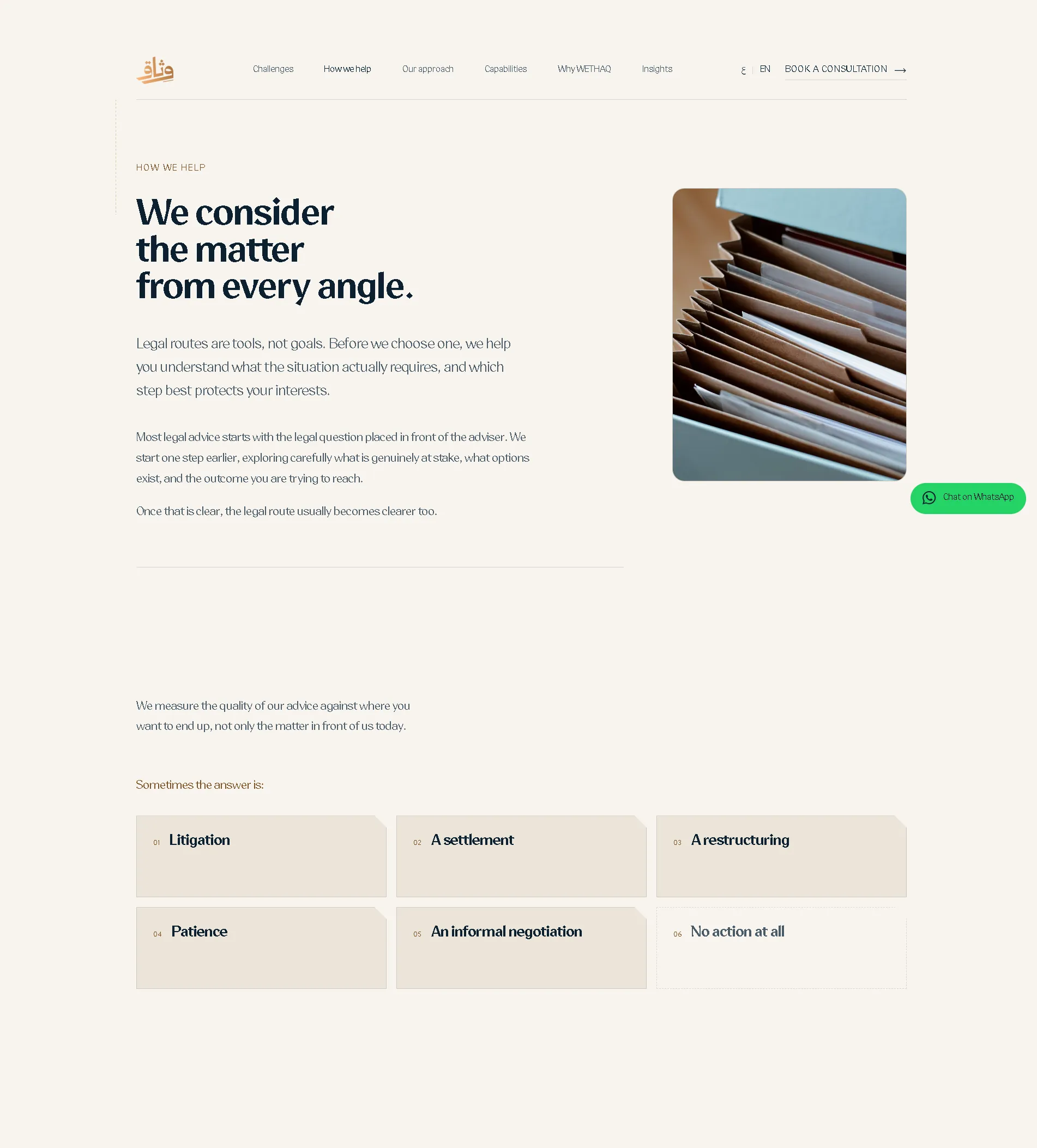
Drawer, doors, register
Situations pull sideways like files in a drawer as you scroll. The six answers are doors; the sixth — “no action at all” — is drawn as an absence: no fill, a dashed hairline. Services read as ruled rows, like a real ledger.
The spine
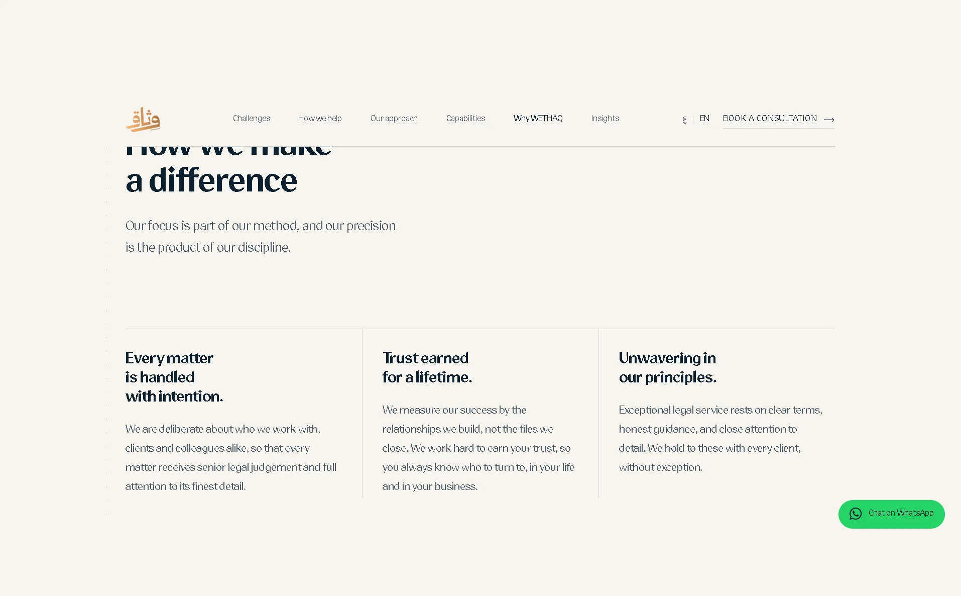
A single rule runs the full height of the page and changes character with each chapter it crosses — solid, dashed, ticked. The least visible piece of the build, and the one doing the most work: it turns variety into structure.
What Arabic-first actually costs
Nominal size isn't reading size
An Arabic word body sits at 40% of the em; a Latin x-height is 48%. So 18px of Arabic reads about three sizes smaller. Both reading steps went up a notch.
In RTL, scrollLeft runs negative
Browsers only recently agreed on that. Every position in the horizontal track is derived from element rectangles instead — direction-agnostic, no branching.
Logical and physical don't mix
translate is physical, inset is logical. Together they work in LTR and quietly break in RTL. Caught by measuring a “centred” element and finding it off-centre.
Measured, not asserted
The working rule: a design claim is worth what its measurement is worth. It caught things review never would have.
What shipped
Inside the page

Lots of content, and a page that reads like a Word doc?
Let's give each section the shape its thinking deserves — and measure the difference instead of claiming it.
Tell me about your project