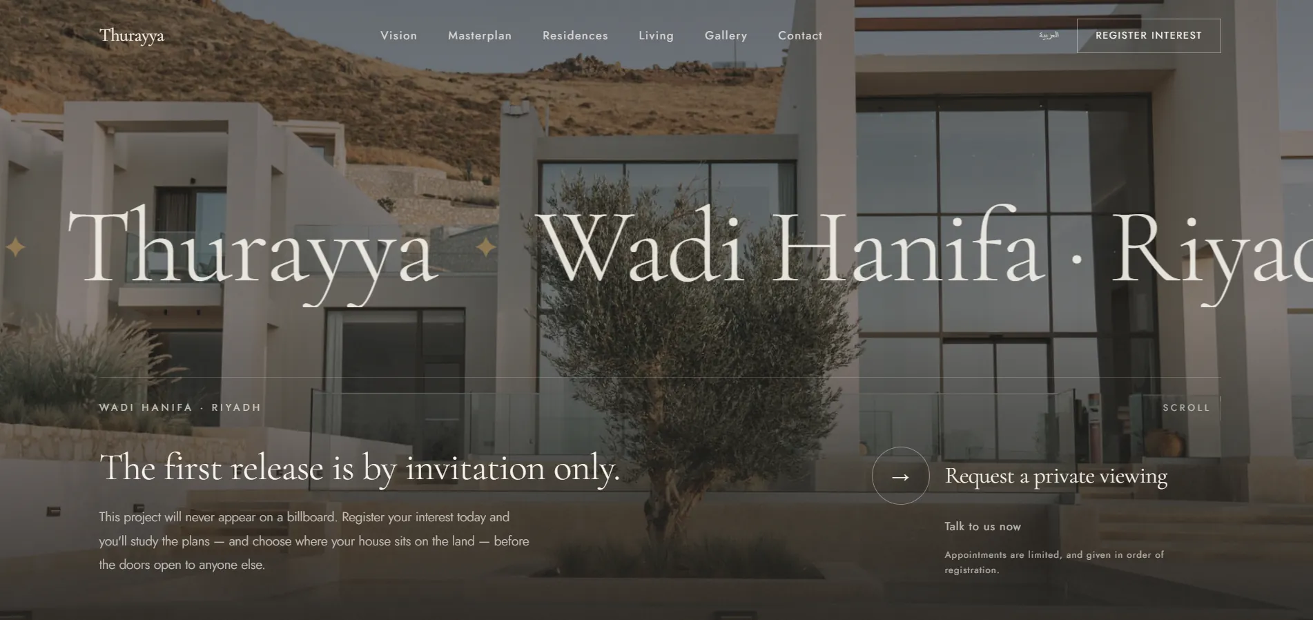
The challenge
How do you sell 48 homes when not a single stone has been laid? The buyer here isn't buying rooms — they're buying status, scarcity, and trust in a developer whose work they cannot see yet. The challenge: one page that builds that feeling entirely, and ends with a single clear step — register your interest before the door opens to someone else.
The approach
Luxury through subtraction
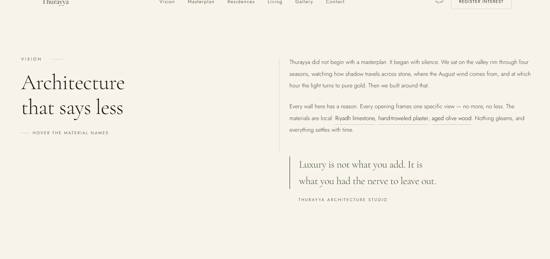
Generous white space, elegant Arabic typography, and a quiet earthy palette — the page whispers instead of shouting, so the brand reads confident and expensive without bragging.
A narrative that leads to signup
Vision → Masterplan → Residences → Life → Gallery → Register. Each section raises desire one notch, and the path ends at a single, undistracted form.
Honest scarcity that moves the decision
"Phase one is released by invitation only" and "limited appointments" — scarcity built into the design itself, with direct WhatsApp for those ready now.
By the numbers
Four problems — each one motion taking more than its share
3.27 seconds lost to an animation
The hero copy shipped at zero opacity and was revealed by GSAP once JavaScript loaded. Measured, that was 3.27s of "element render delay" on the LCP element itself. I moved the entrance to CSS @keyframes: it starts as soon as the stylesheet is parsed — before first paint — so the motion now costs LCP nothing beyond its own duration.
I also added an LCP-measuring script to the project so the regression can't come back silently.
Content that vanished if the motion didn't run
The reveal rule started elements at zero opacity — so if a ScrollTrigger failed to fire for any reason, a whole column of content stayed invisible while still taking up space. The new rule: content is visible by default, and motion is an enhancement on top, not a condition for being seen. The same principle went into the mobile menu.
Content that only appears if an animation succeeds will, one day, not appear.
An animation playing to nobody
The masterplan drawing (the wadi, Diriyah, the parcel) was tied to an element that scrolled on, while the plan itself is sticky on desktop — so the drawing finished after the plan had left the screen. I re-tied the motion to the plan itself, so it draws while the visitor is looking at it.
Motion nobody sees is cost with no return.
Pick a landmark, and the plan comes back to you
On mobile the plan isn't sticky, so tapping a landmark in the list drew its bearing on a plan that had already scrolled away. Now the selection brings the plan back with it. On desktop nothing moves: the plan is sticky and already in view, and moving the page there would be rude.
And the bearings end inside a 375px-wide plan without running off it.
What actually shipped
- Hero with a CSS entrance that doesn't delay paint
- Vision section
- Interactive masterplan with landmarks and bearings
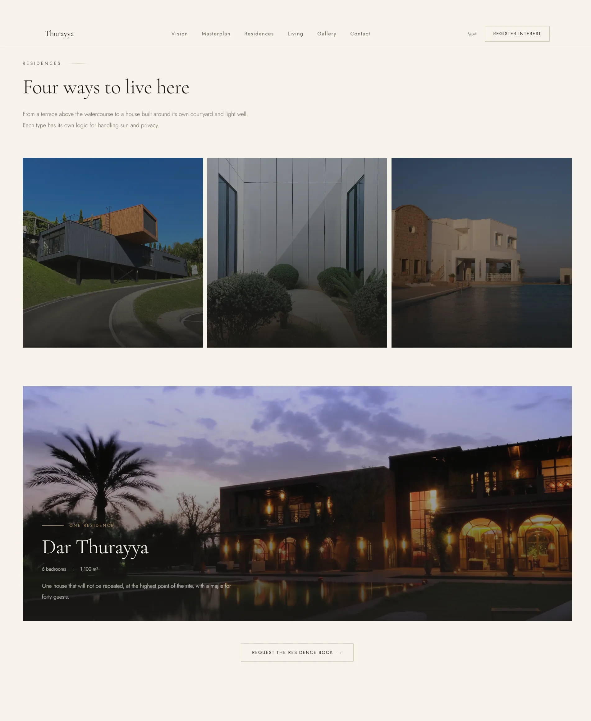
- Residences — 4 home types
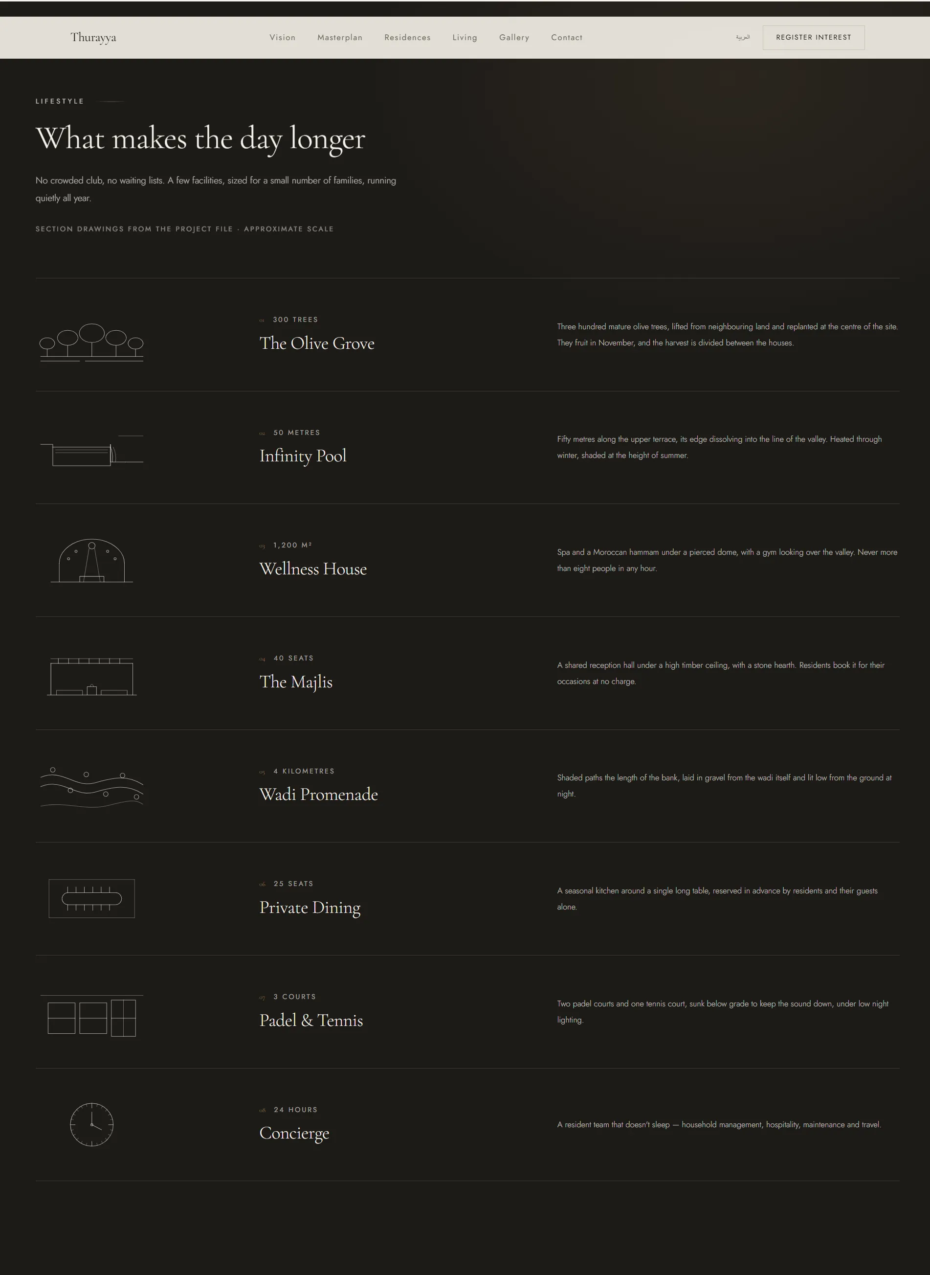
- Amenities
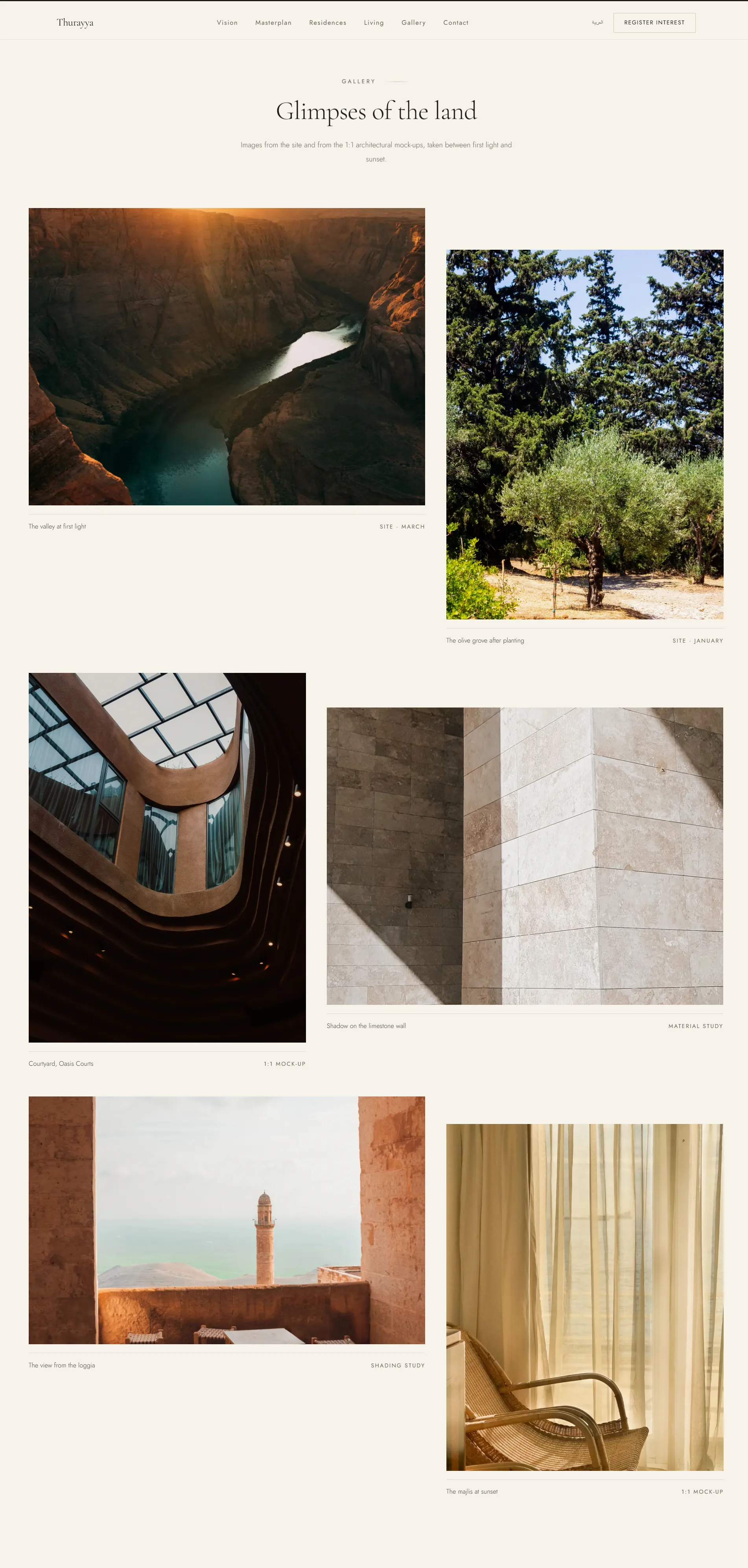
- Gallery
- Register-interest form
- Direct WhatsApp contact
- Instant Arabic / English switch
- Respects the "reduce motion" setting
The lesson that stayed
Motion is part of what makes this page feel premium — yet every serious problem in it was motion taking more than its share: delaying paint, hiding content, or playing to nobody. So the principle became clear: motion is an enhancement on top of a page that works without it.
Content shows first; motion comes on top.
Results — real Lighthouse measurements
Inside the page
Have a property project to sell?
Let's build a page that creates desire and brings you real prospects — not just visitors.
Contact me